Tips that haven’t made it into my lecture notes yet
Selecting Research Questions
- Be aware that when attempting to measure intangibles like momentum or clubhouse chemistry, the signal to noise ratio is often low. That means you generally need large amounts of data and sophisticated analysis methods to pick up on the signal. If you’re just getting started in sport analytics, I recommend picking research questions about more tangible aspects of sports.
Developing Metrics
- Something I see from students occasionally is that they will “make up” a metric by throwing some existing metrics together through multiplication or addition with only a hand-wavy justification of what the made-up metric is measuring. I want you to understand that metrics are derived (as estimands of model parameters) rather than “invented”.
Reporting Results
When reporting numeric results, don’t report too many digits.
For example, when you use R or Python to calculate the correlation between two vectors, your computer might spit out a result like 0.13083978. The interpretation of this output is that the correlation is 0.13. If you copy and paste the full number 0.13083978 into a report, that does two things:
- it injects white noise (083978) into your report, distracting the reader from what’s important; and
- it suggests to the reader that you don’t understand what is the meaning of your result.
When presenting your results, your purpose is to convey meaning. As a simple rule of thumb, two or three significant digits would usually be appropriate for this purpose. Four digits would be pushing it, and five or more digits would be over the line.
When plotting two variables that have the same unit of measurement, choose your x- and y-axis limits so that the aspect ratio is close to 1:1.
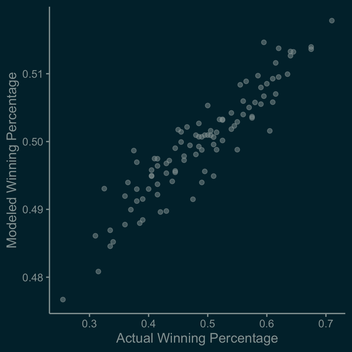
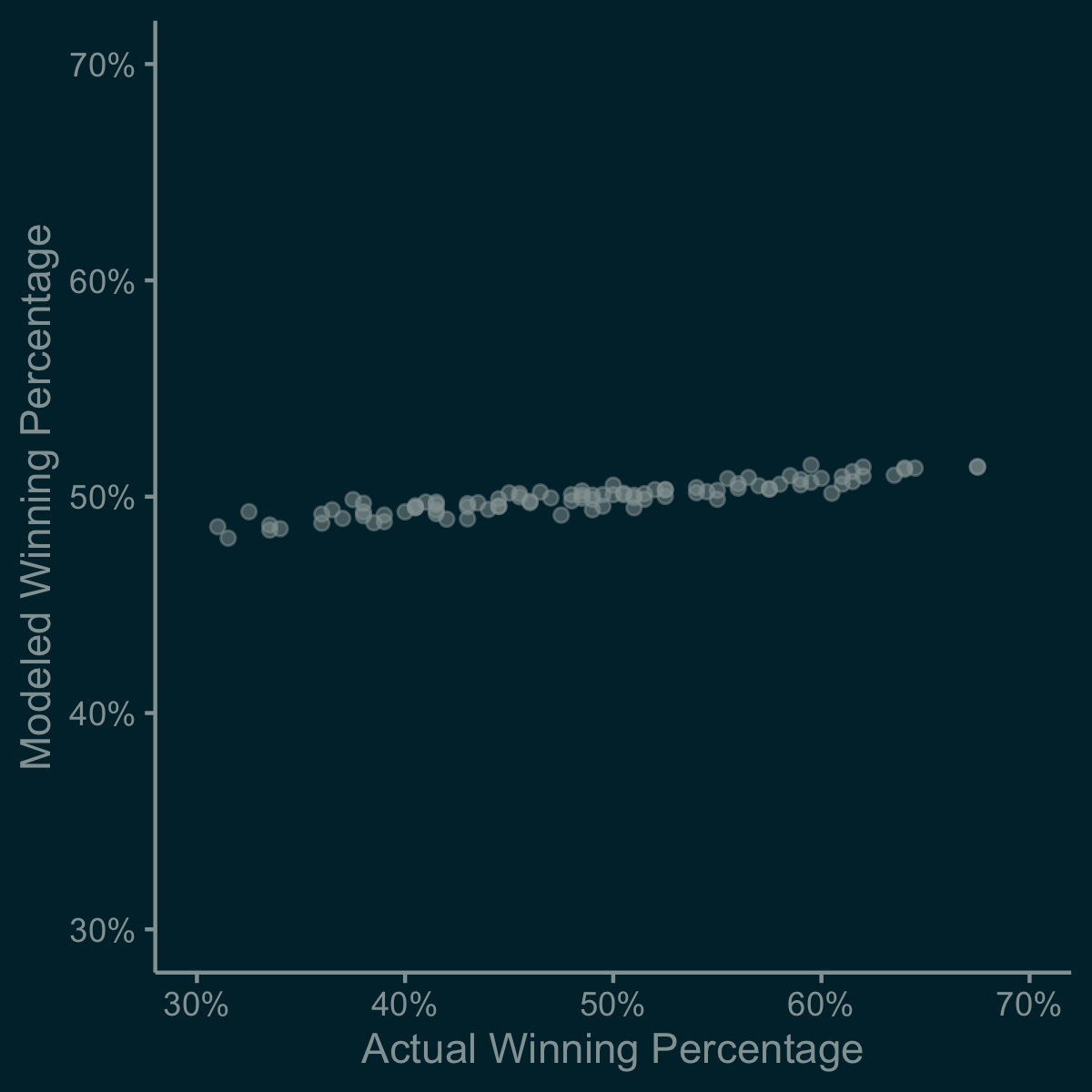
The scale that you choose for your x- and y-axes can have a huge impact on the perception and qualitative interpretation of your results. For example, consider the following two plots which display the exact same data (actual winning percentage on the x-axis and modeled winning percentage on the y-axis, same units for both variables: wins per game).


At first glance at the first plot, you might jump to the conclusion that modeled winning percentage aligns reasonably with actual winning percentage. But did you notice the scale of the y-axis? The second figure clearly communicates the important takeaway: modeled winning percentage is way more compressed than actual winning percentage. Perhaps this is how things should be, or perhaps this indicates a bug in your model. Either way, the second figure conveys the meaning of your results more effectively.
That’s it. That’s the list. I will add to it if/when I come across additional common pitfalls that compel me to write them up.